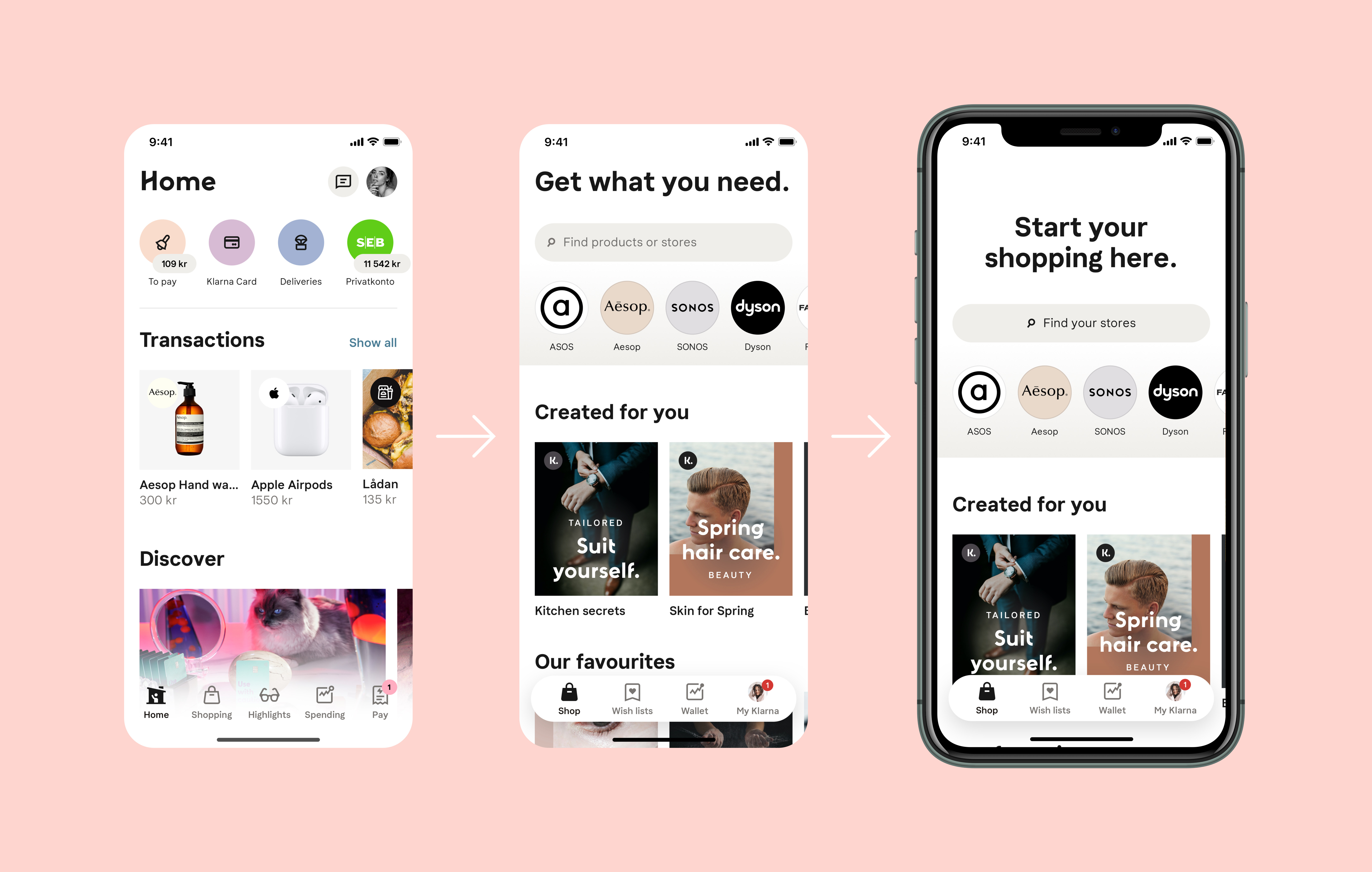
From the home feed to the shopping feed to the inspiration feed.
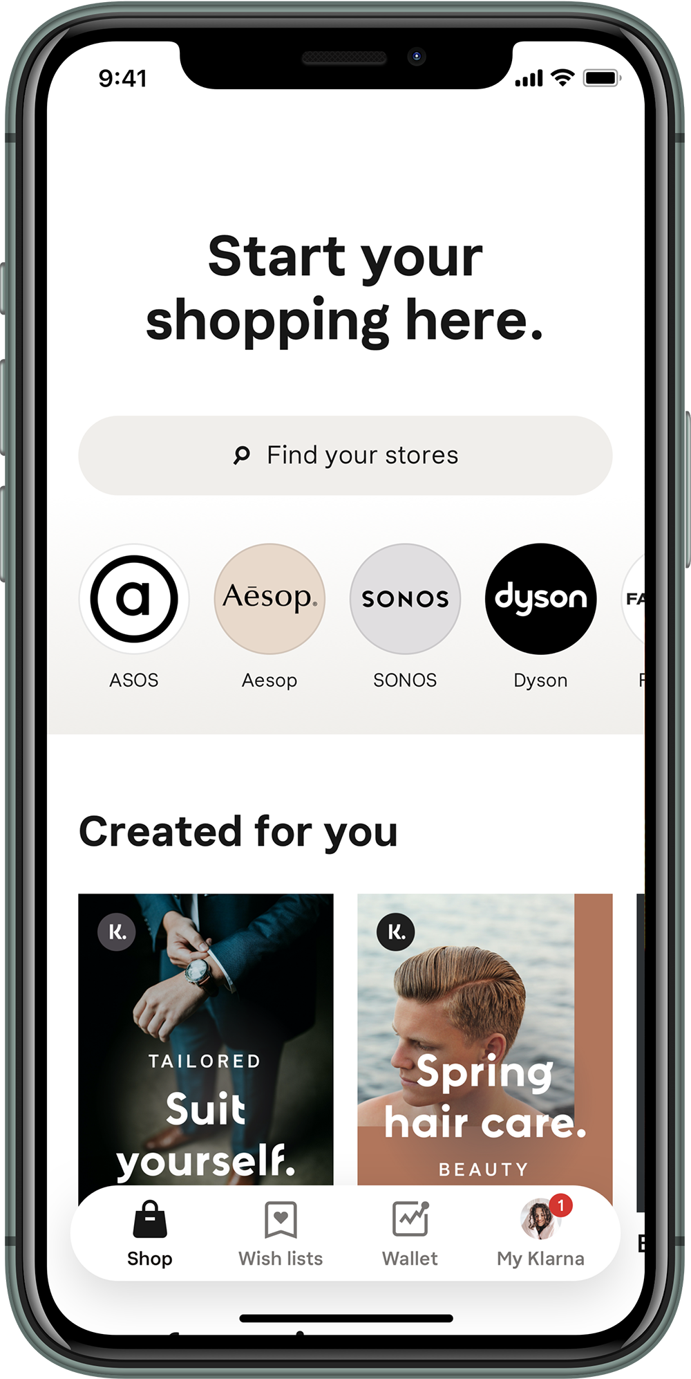
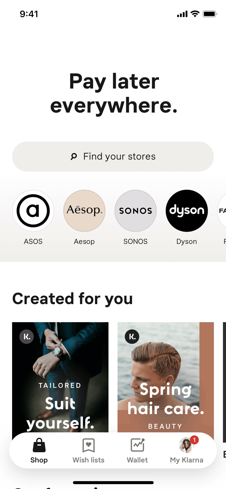
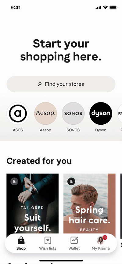
During my time at Klarna I focused on the design of the home feed, the first tab that the user sees when entering the app. The home feed consisted of personalised shortcuts to your items to pay, your Klarna card, deliveries and the bank account(s) users had connected. The shopping feed took another approach and was more focused toward the shopping experience of the user. Displaying on top a search bar, shortcuts to your favourites merchants. The second part was a list of carrousel made of manually curated shopping lists. One was specifically selected for the user according to their interests previously selected and another more generic allowing the user to discover more. Also Deals, recently visited merchants and some articles made by Klarna.
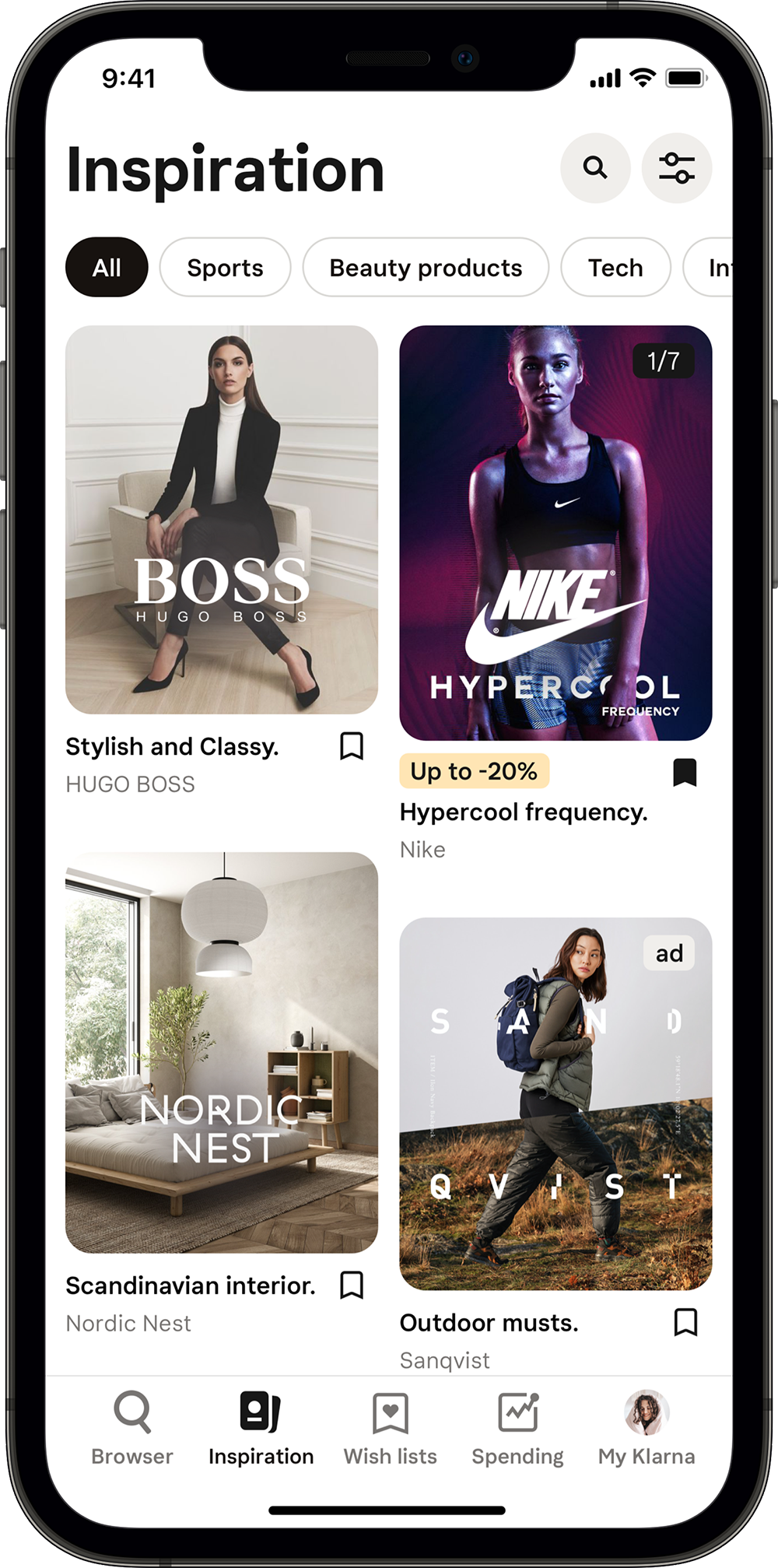
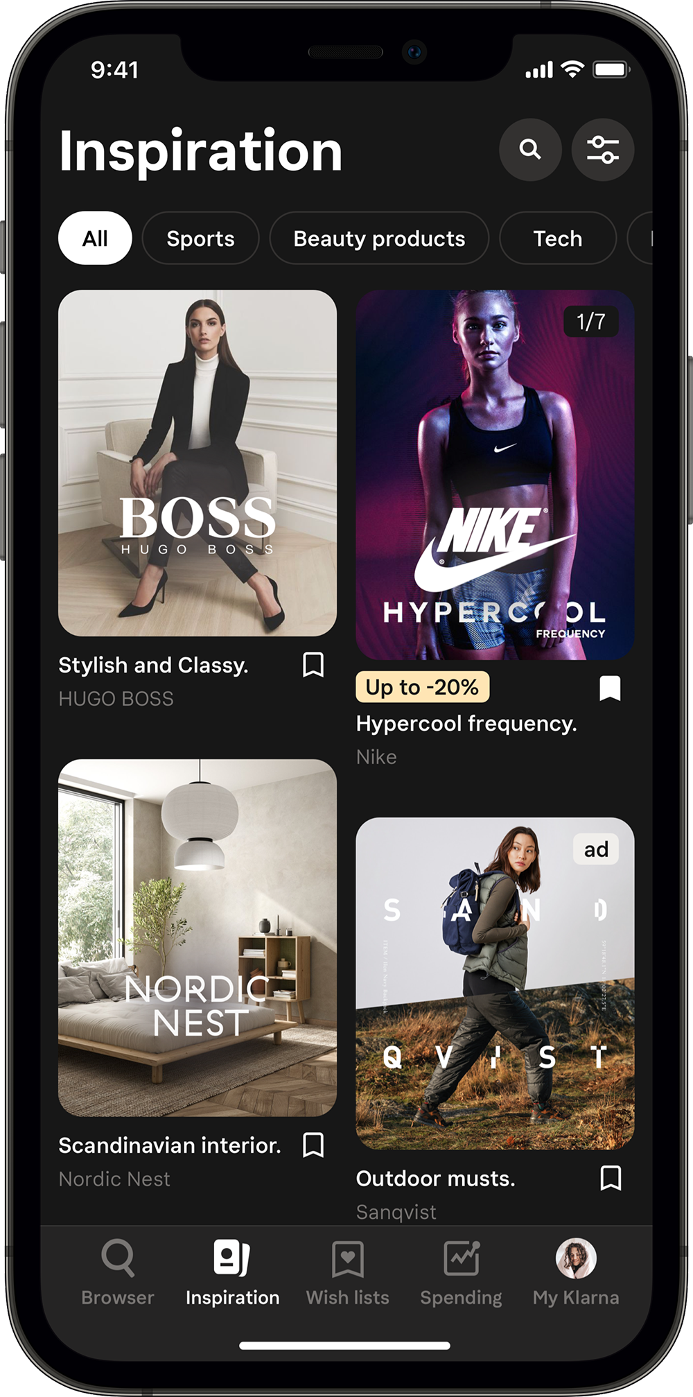
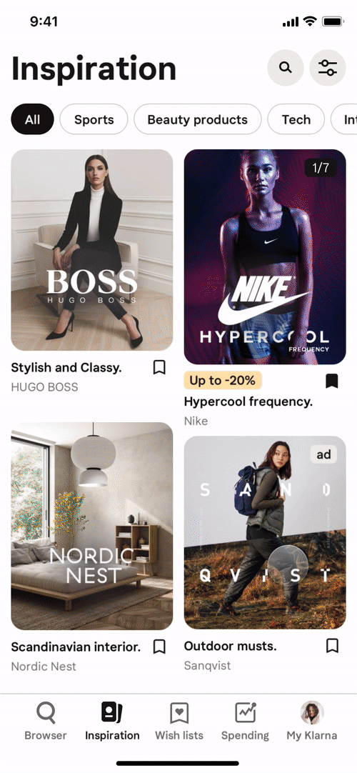
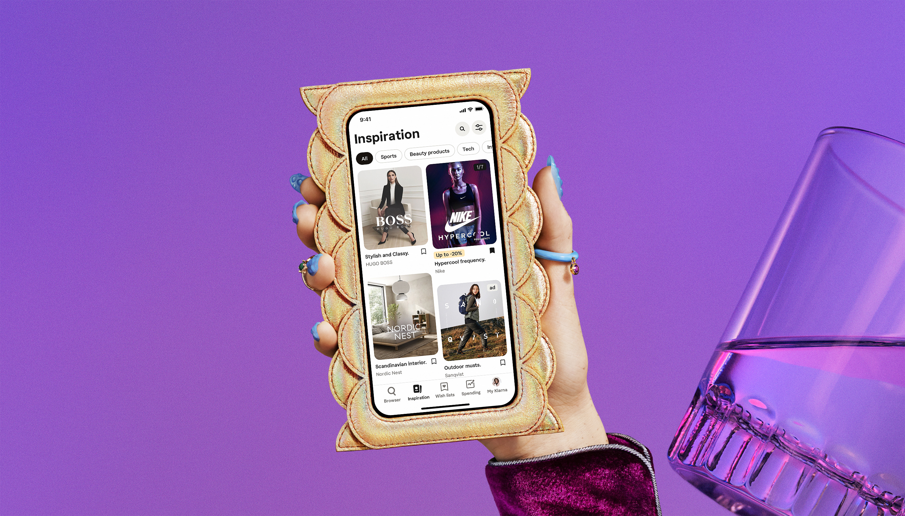
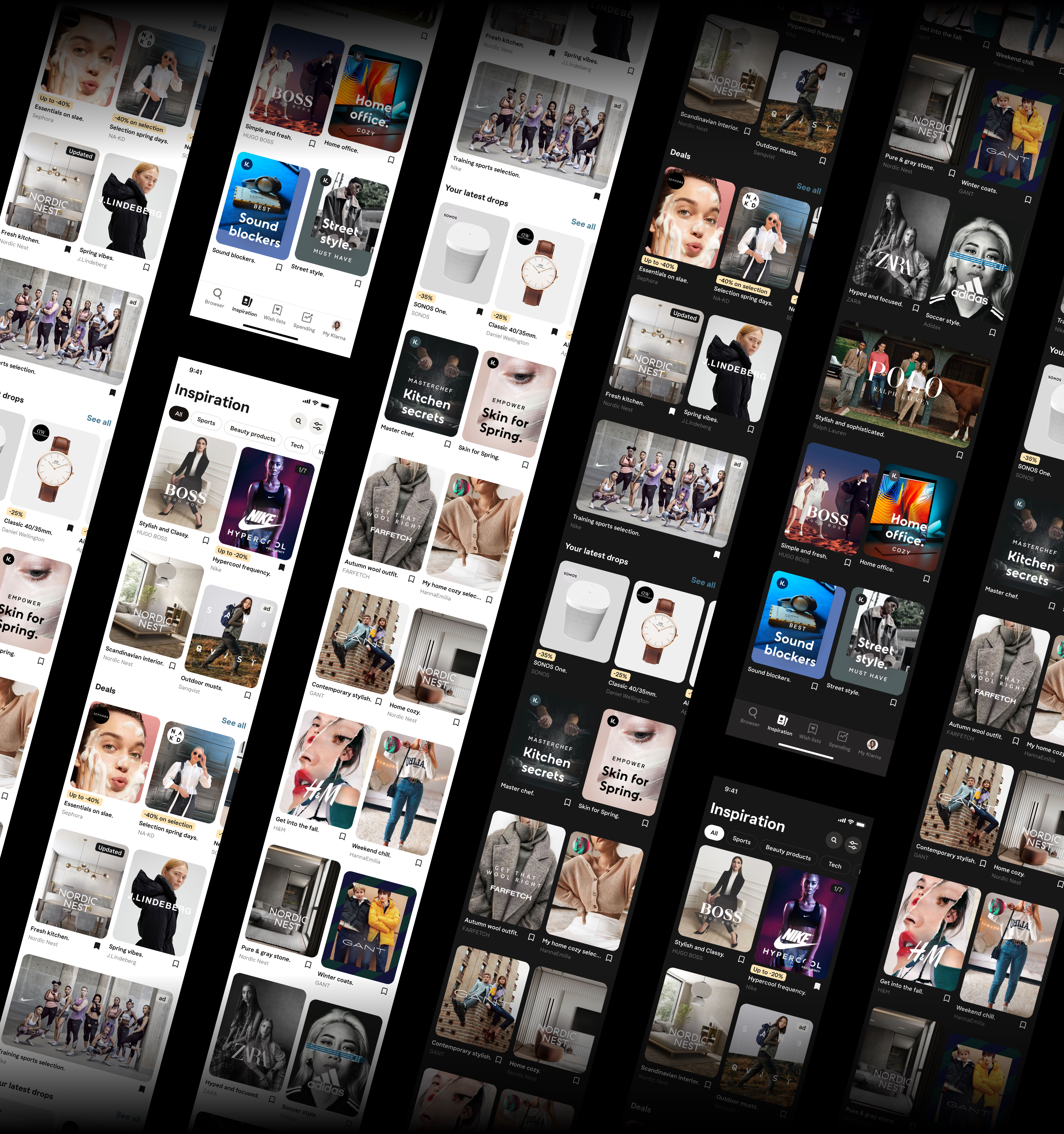
Providing smarter and more flexible experience of the Inspiration feed.
The inspiration feed is a section of the consumer app showing a personalised feed of content that is seen relevant for a specific user. The idea is to target users who have made a purchase (or entirely new users) by showing relevant content that is both inspirational and Klarna branded. Most importantly the idea is to drive shopping volume and affiliate revenue to Klarna. It is also the only entry point for some features in the app, the user experience should be fluent and features are ranked depending on user behaviour.
Future explorations.
How would the inspiration feed look and feel if we had more content, more diversity and how could we make it feel like a more seamless browsing experience? Here was some of my challenges when thinking about the possible future states of this feed. My main focus was to create a smarter and more flexible shopping experience for the user. Using a masonry grid with adaptive height placeholders giving the freedom to the different teams of providing any type of content regardless of the dimensions. Displaying curated shopping lists in a smarter way depending on user interests and previous purchases, together with a selection of ads, product drops and deals.